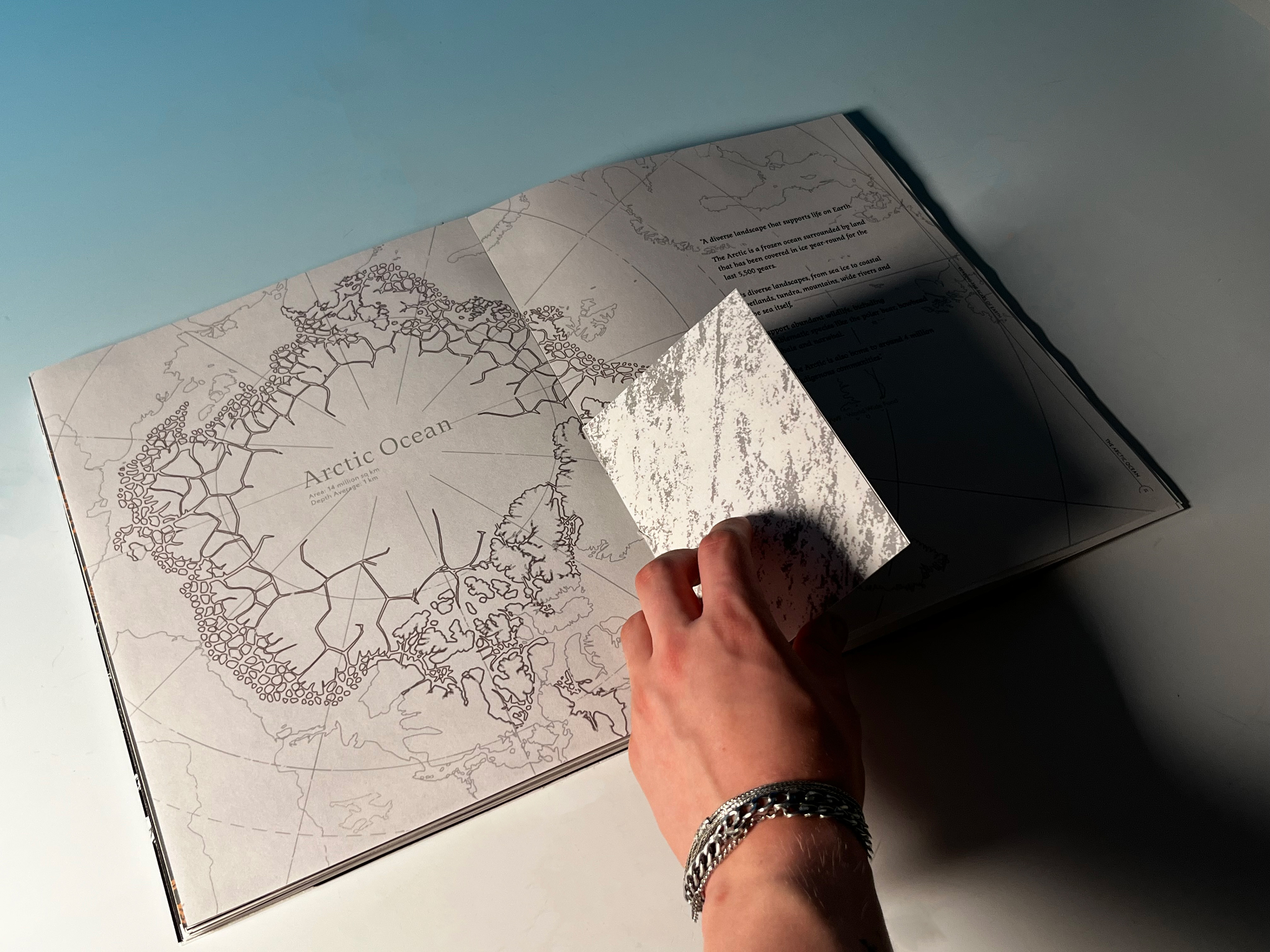
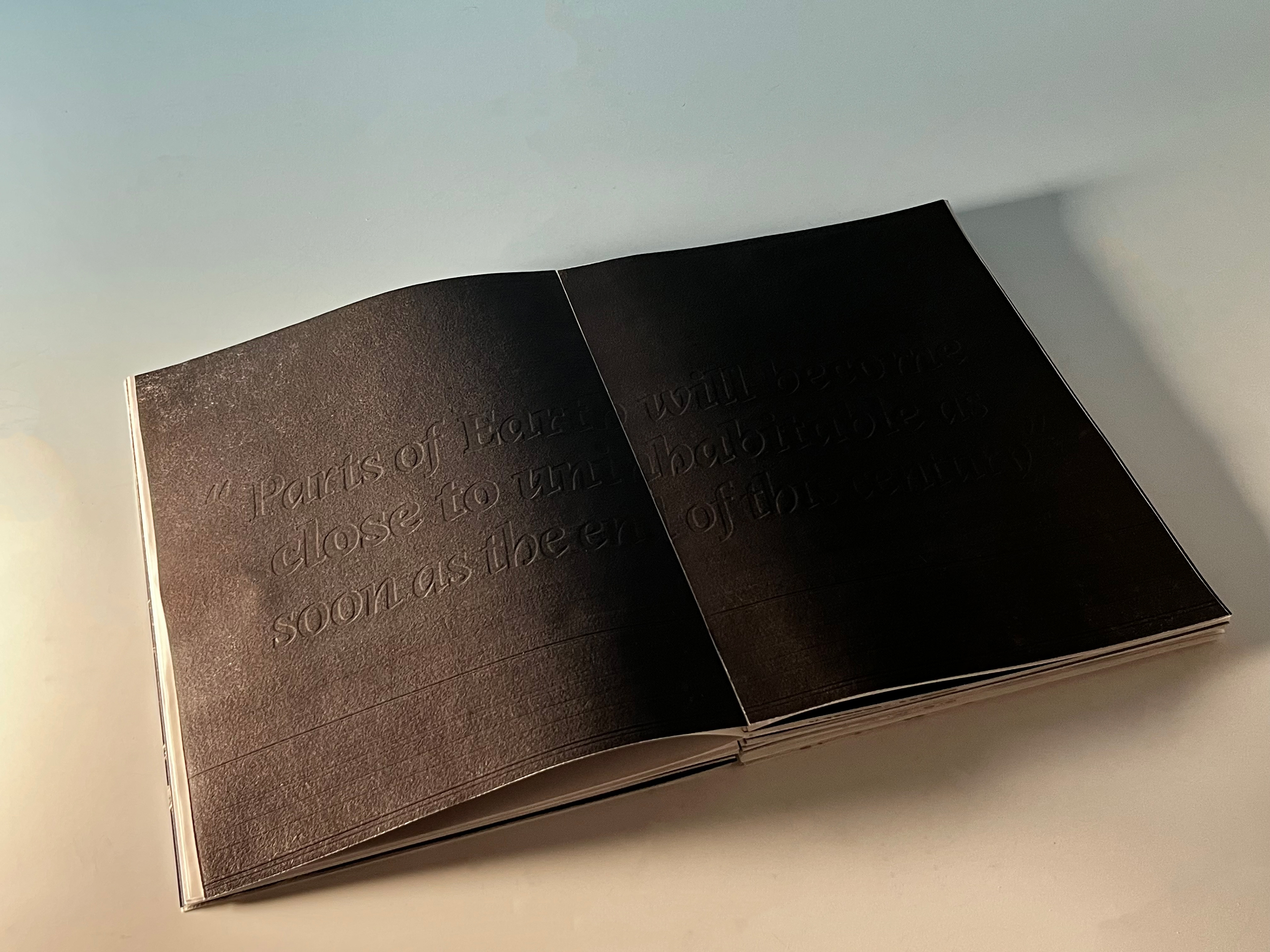
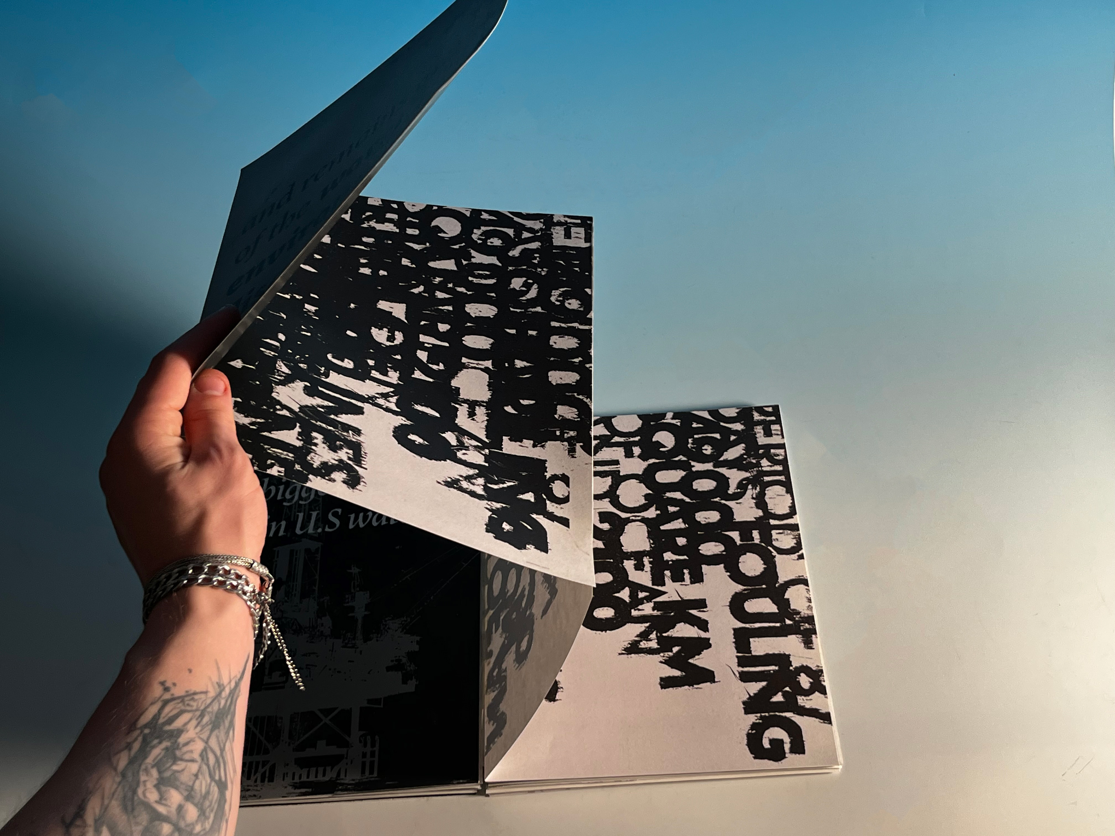
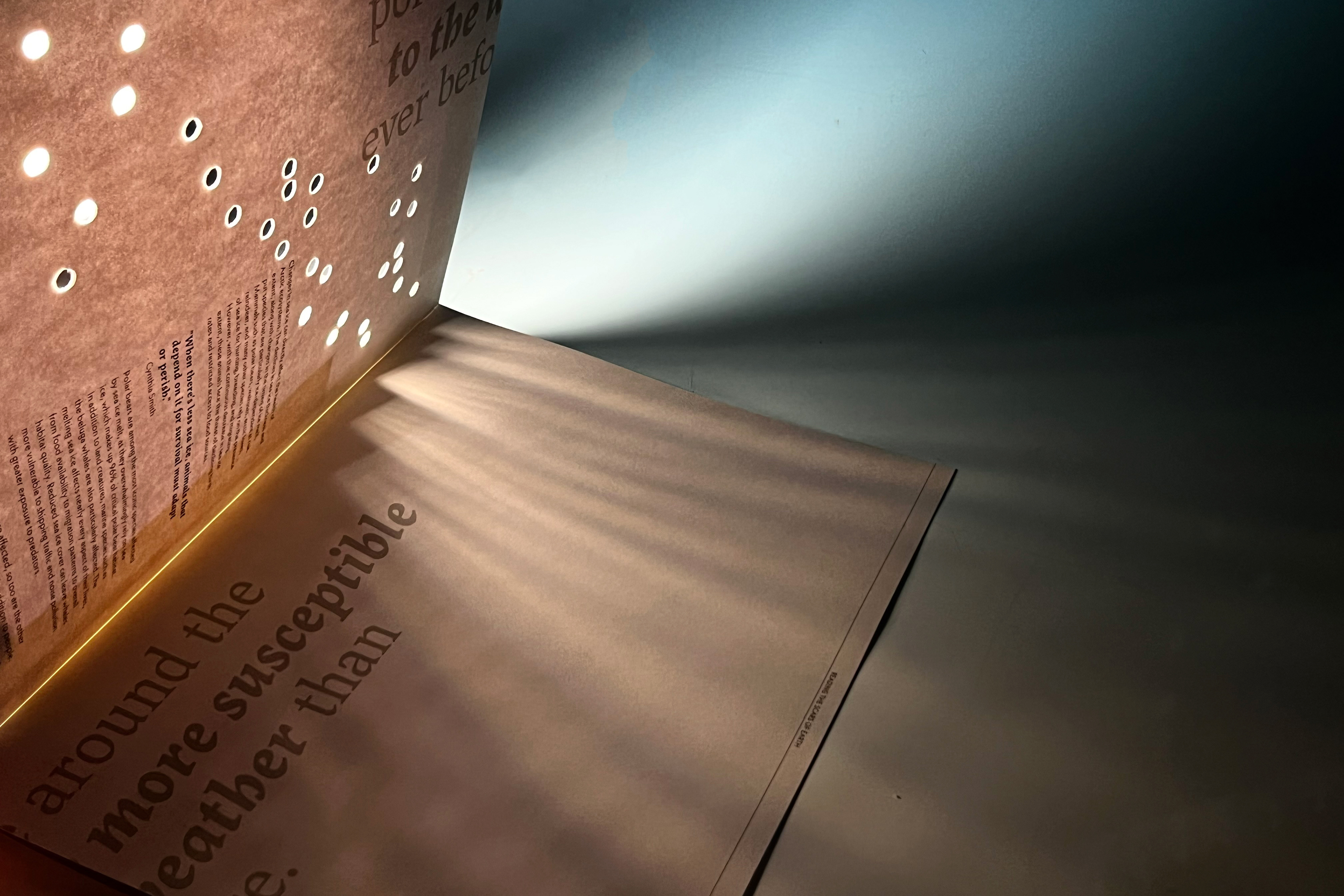
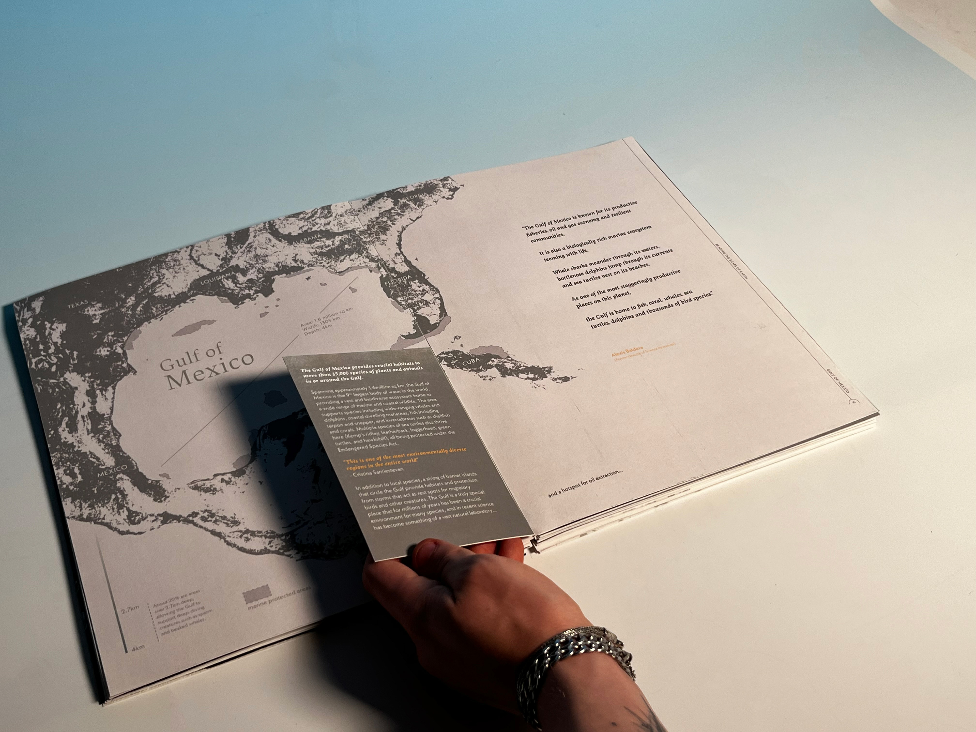
Throughout the publication, the format and finishes have been experimented with through a variety of different physical methods including use of paper making, texture, thermo ink, embossing techniques, paper cutting, hot foil stamping, mark making, tip ins and pull-out spreads.
This approach in design uses the interaction between the reader and the publication to create an immersive reading experience, that highlights the severity of the issues and topics discussed within.
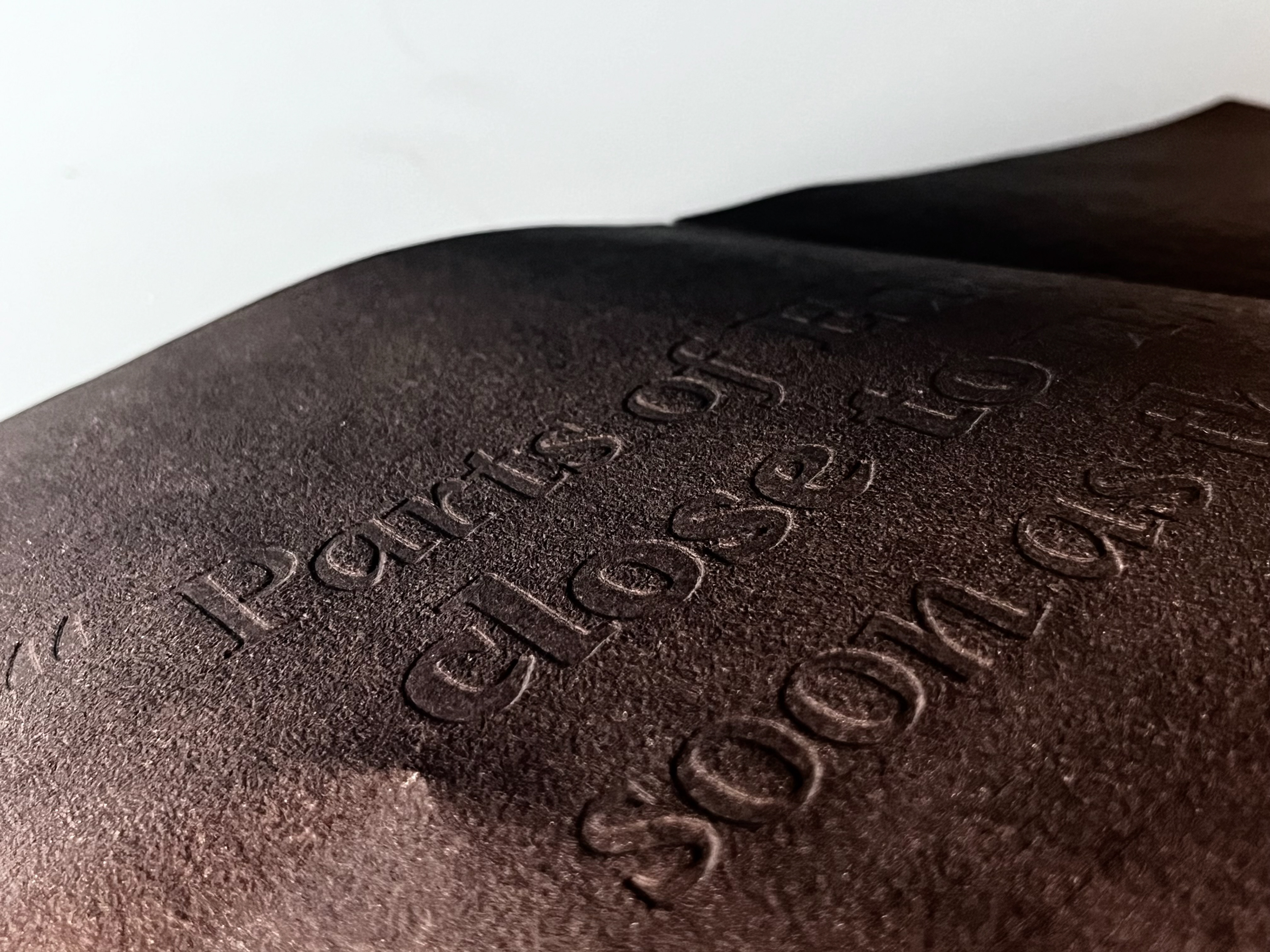
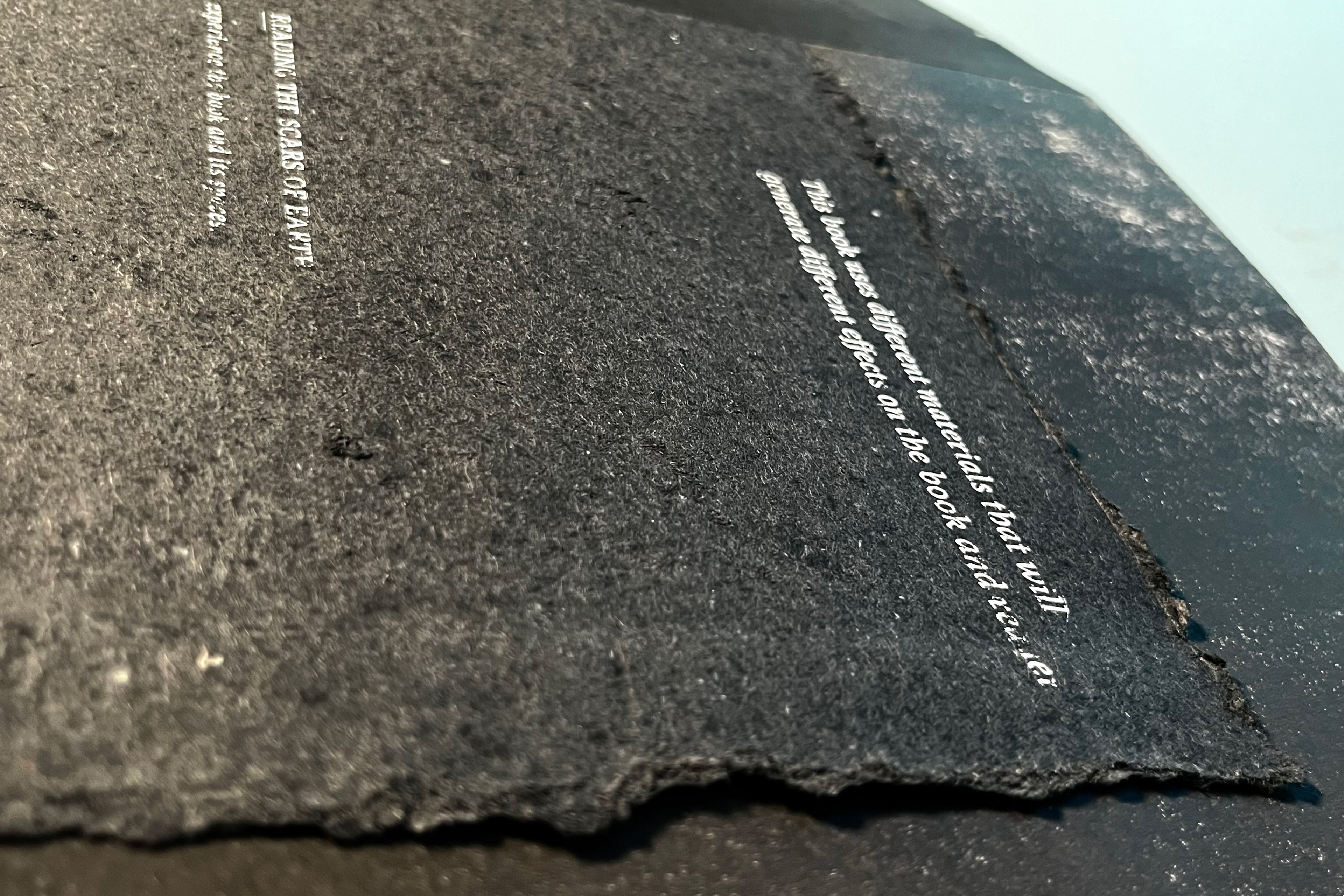
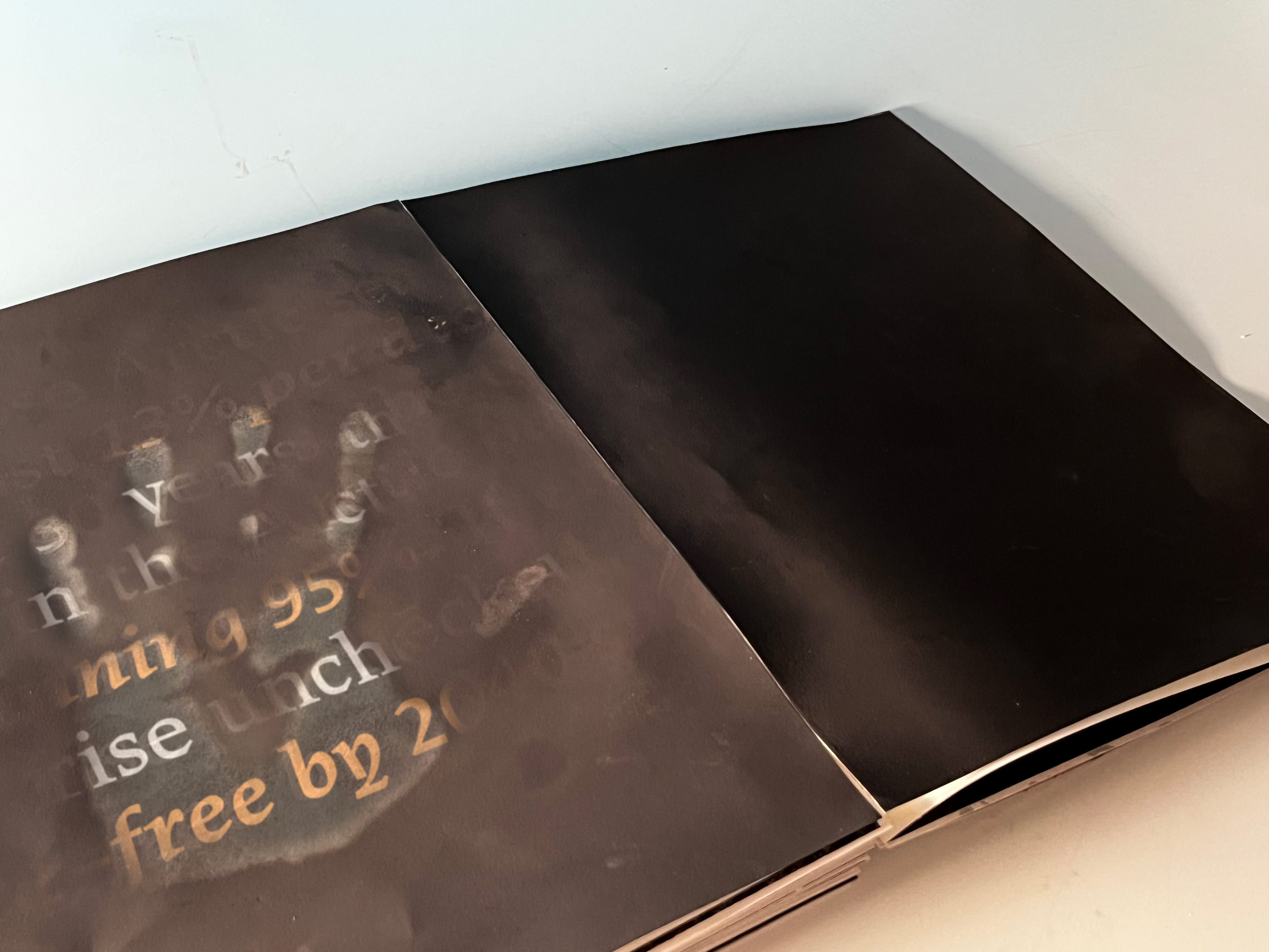
Printing techniques have also been experimented with, creating effects on certain pages that will cause ink to slightly rub off onto the readers hands and onto other pages, causing the pages to get dirtier with continued use, reflective of the planet getting damaged with continued human interaction.
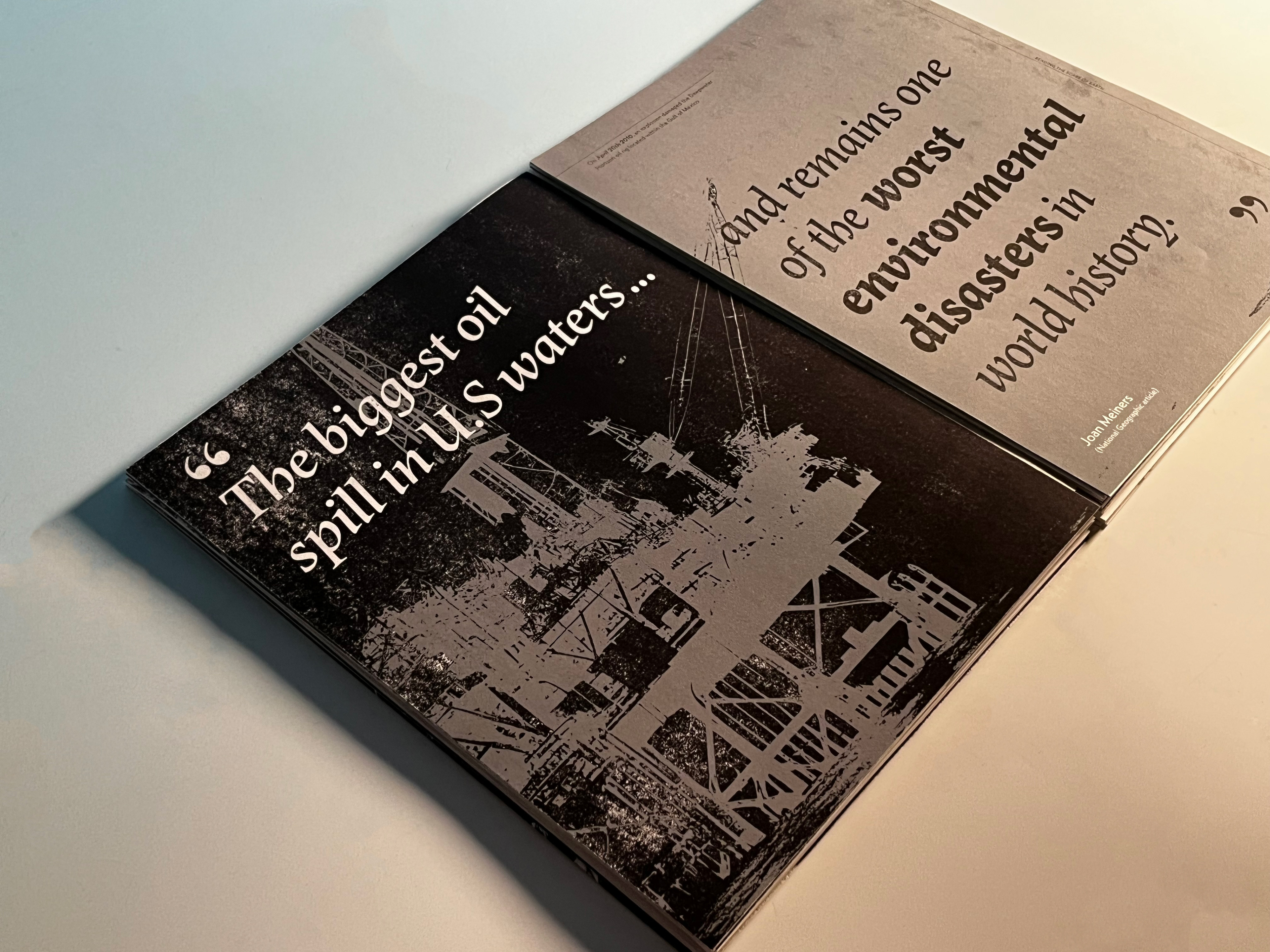
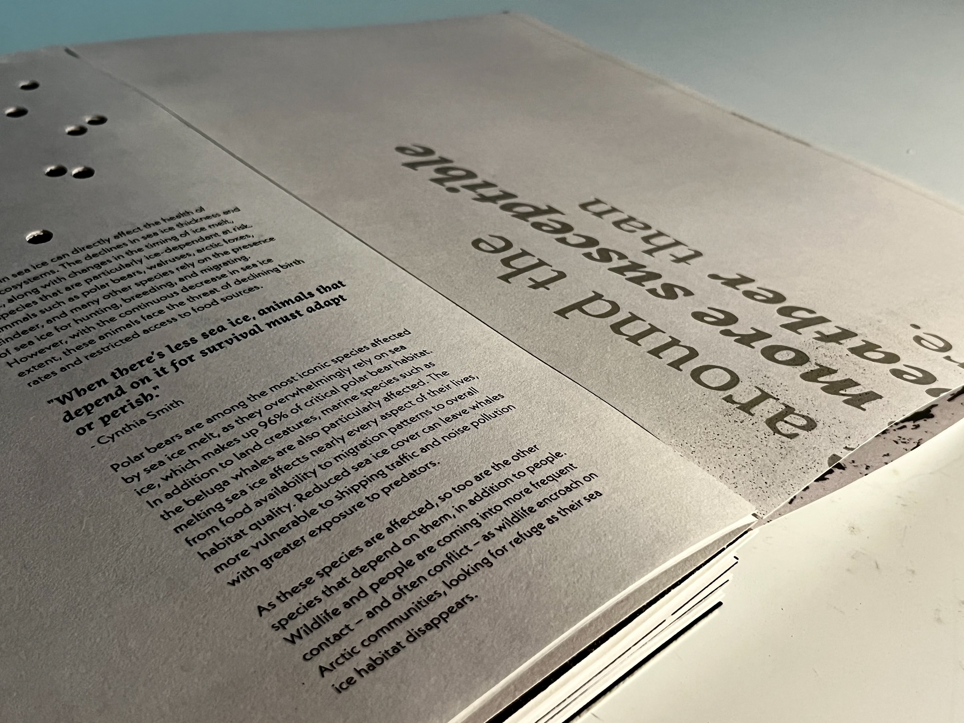
From a typographic perspective, 'Lapture' by Albert Kapr, provided a serif typeface with unique characteristics of blackletter shapes within a roman design structure which aligned to my concept of alteration. In contrast to this, Rudolf Koch’s Neue Kabel, a sans serif typeface, that with its unusual liveliness, felt appropriate within the context of this publication.
These typefaces provided a combination that allowed for experimentation within its typographic approach in regard to the contrast and hierarchy within the layout. This playful approach reflects the concept of exploring through these once untouched natural spaces that have been broken by humanities actions.

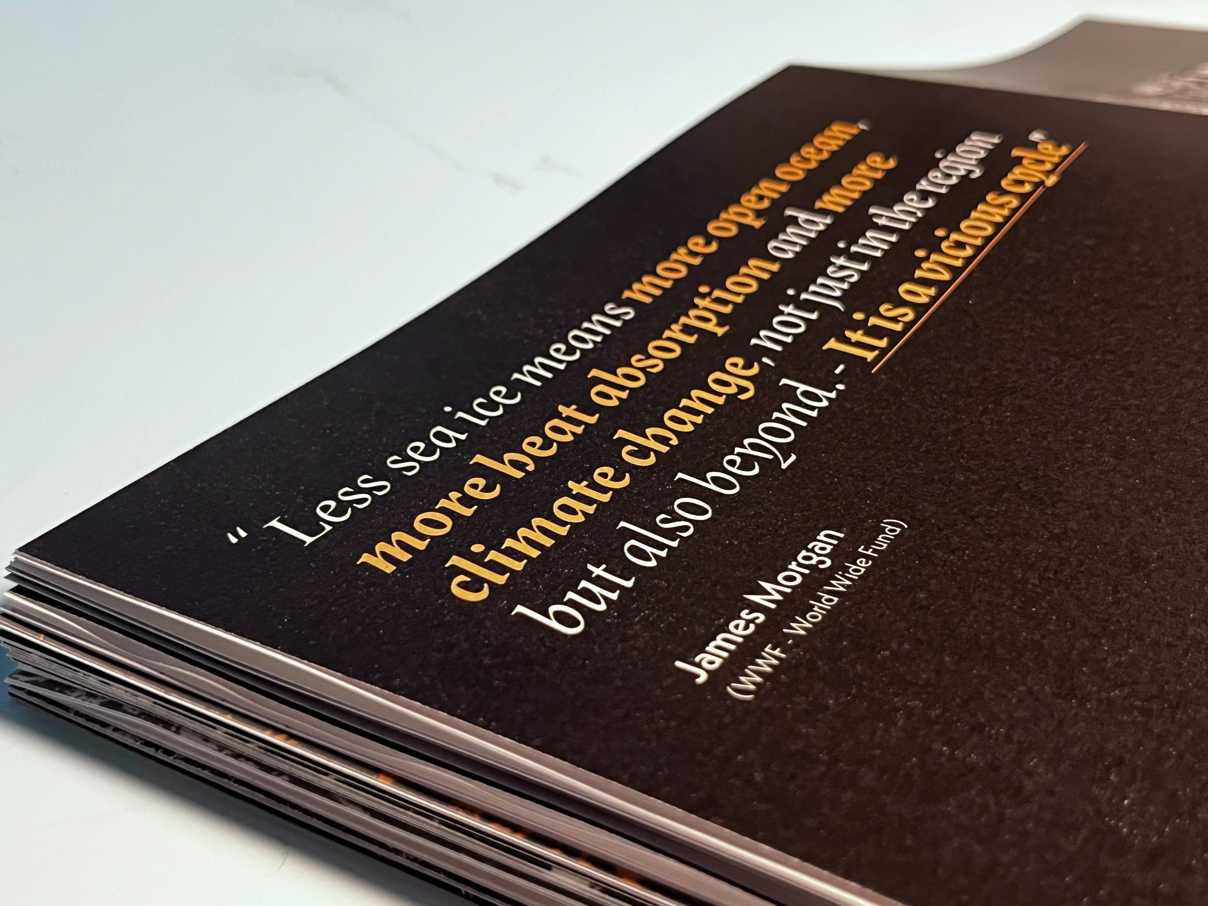
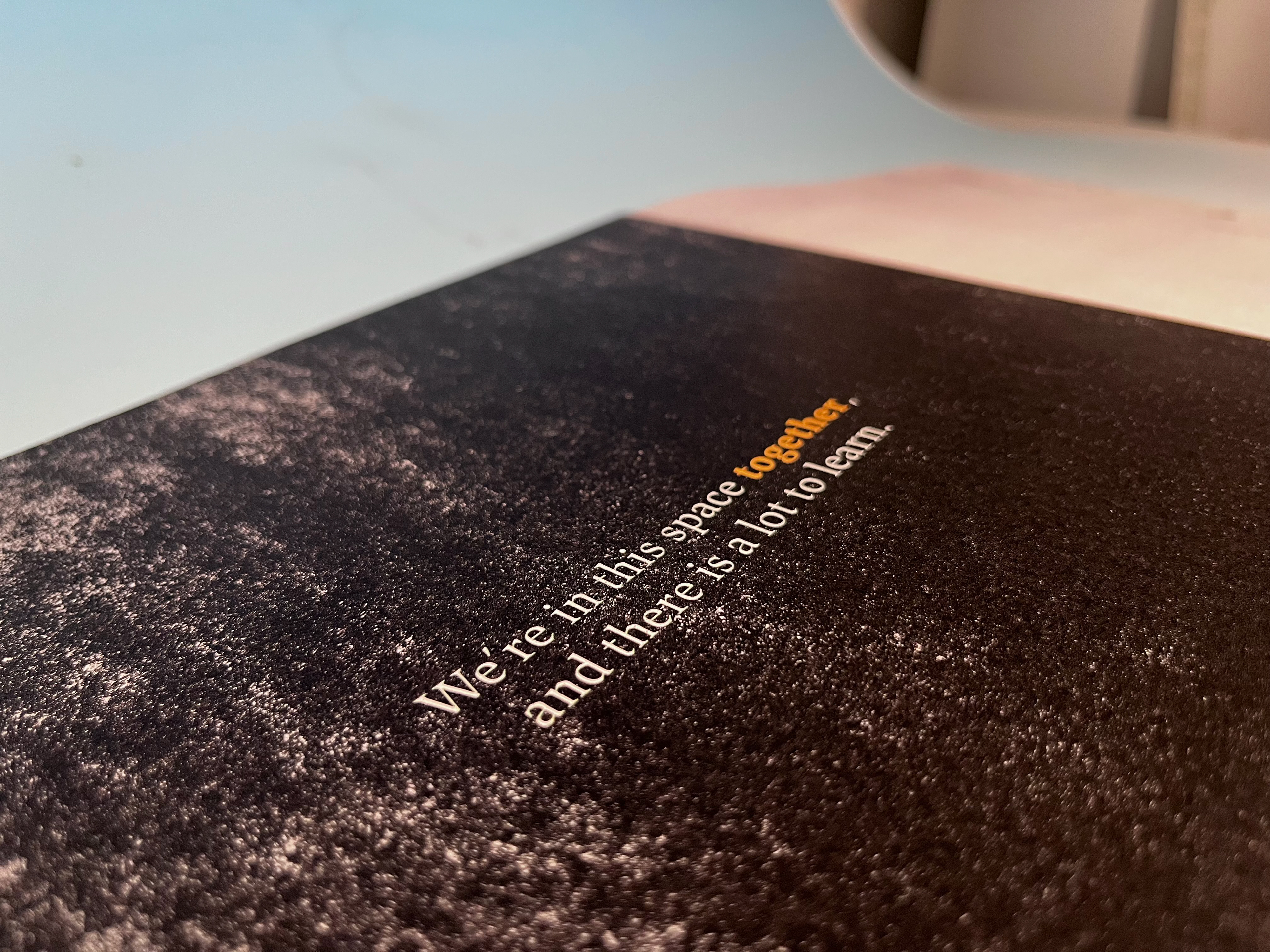
In regards to colour, a bright white, a dark black, a muted teal, and a light burnt orange were chosen. This colour palette creates a strong contrast between the dark and light backgrounds and a shift in tone throughout the pages that reflected the context. The light burnt orange creates a strong contrasting colour and reinforces this sense of urgency.