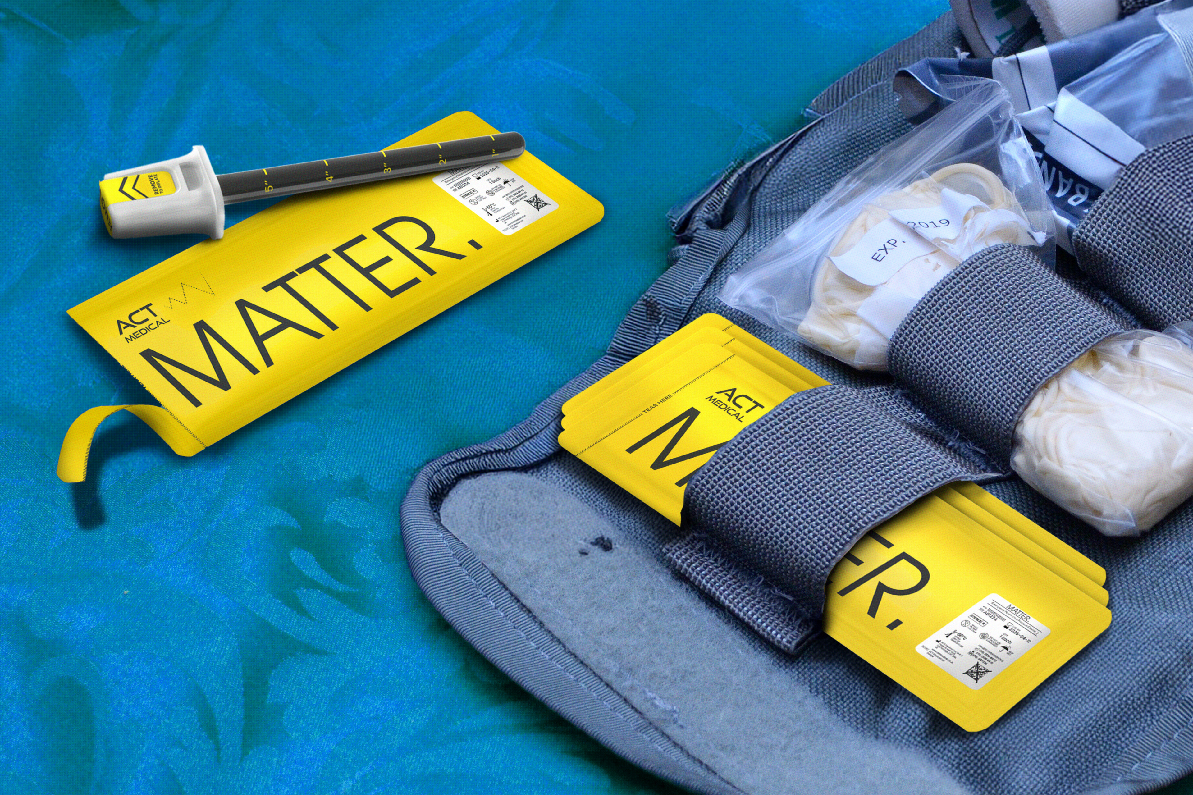
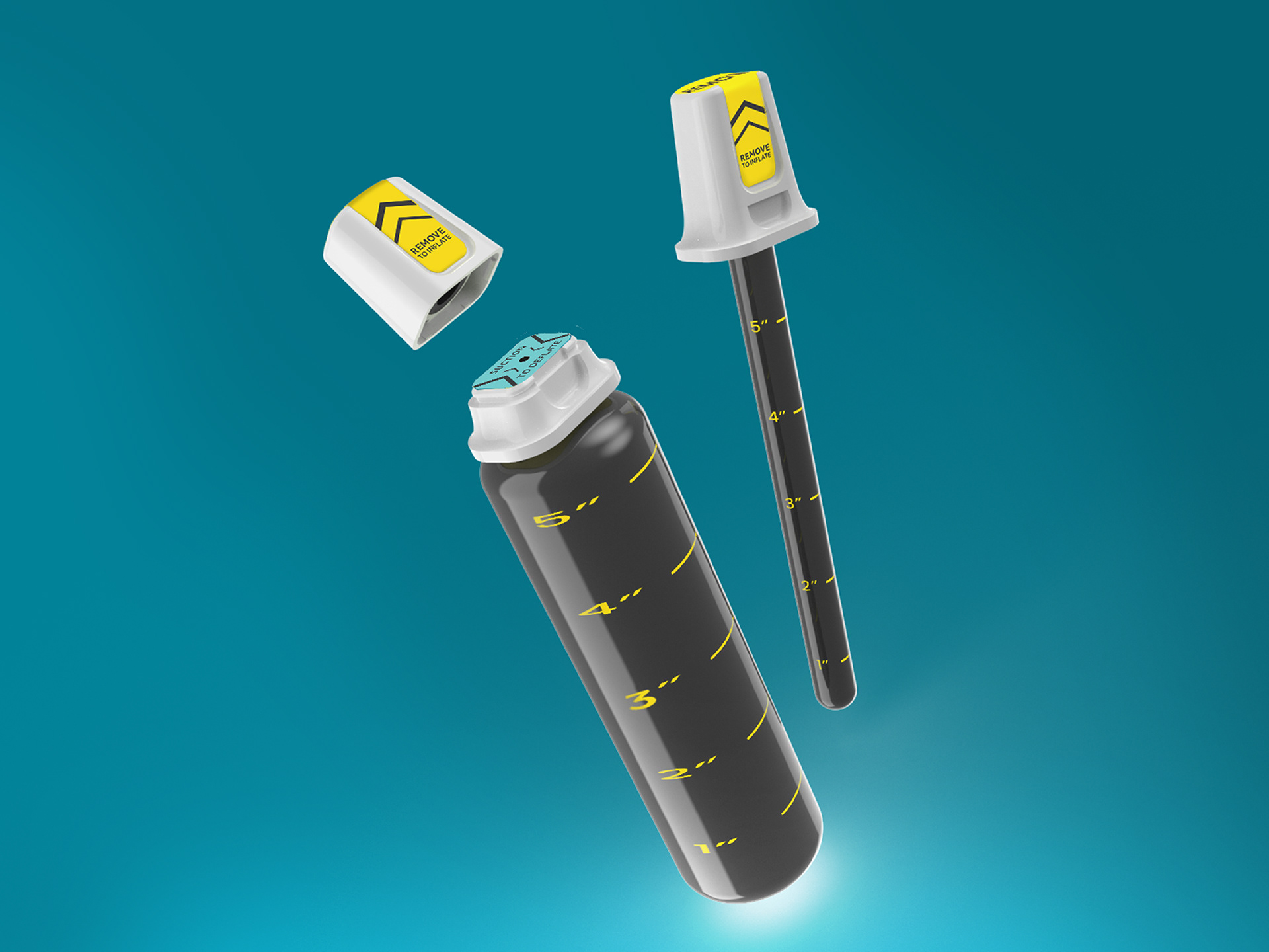
Using engineered sponge, the device can be inserted directly into a wound, rapidly expanding to apply pressure and control the bleeding from within. This innovative tool gives first responders a portable, purely mechanical, easy-to-use solution that drastically reduces blood loss and creates crucial time for victims to reach advanced medical care.
We focused our brand on the aspect of this device reducing the amount of time it takes for a victim to get medical care and created 'MATTER'. The name of the brand, 'Matter', is a synopsis for all things that matter when it comes to knife crime incidents: Lives, Time, Tools and Community. We classified the device as an 'Emergency Penetrative Pressure Device', clearly indicating what the product is: for rapid use in emergency situations, that it goes inside the body and that it applies pressure to stop bleeding.
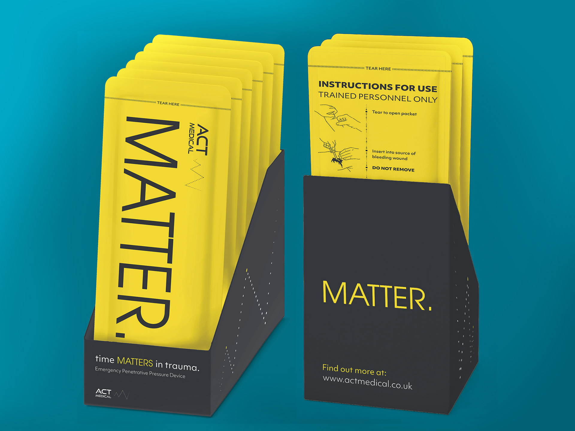
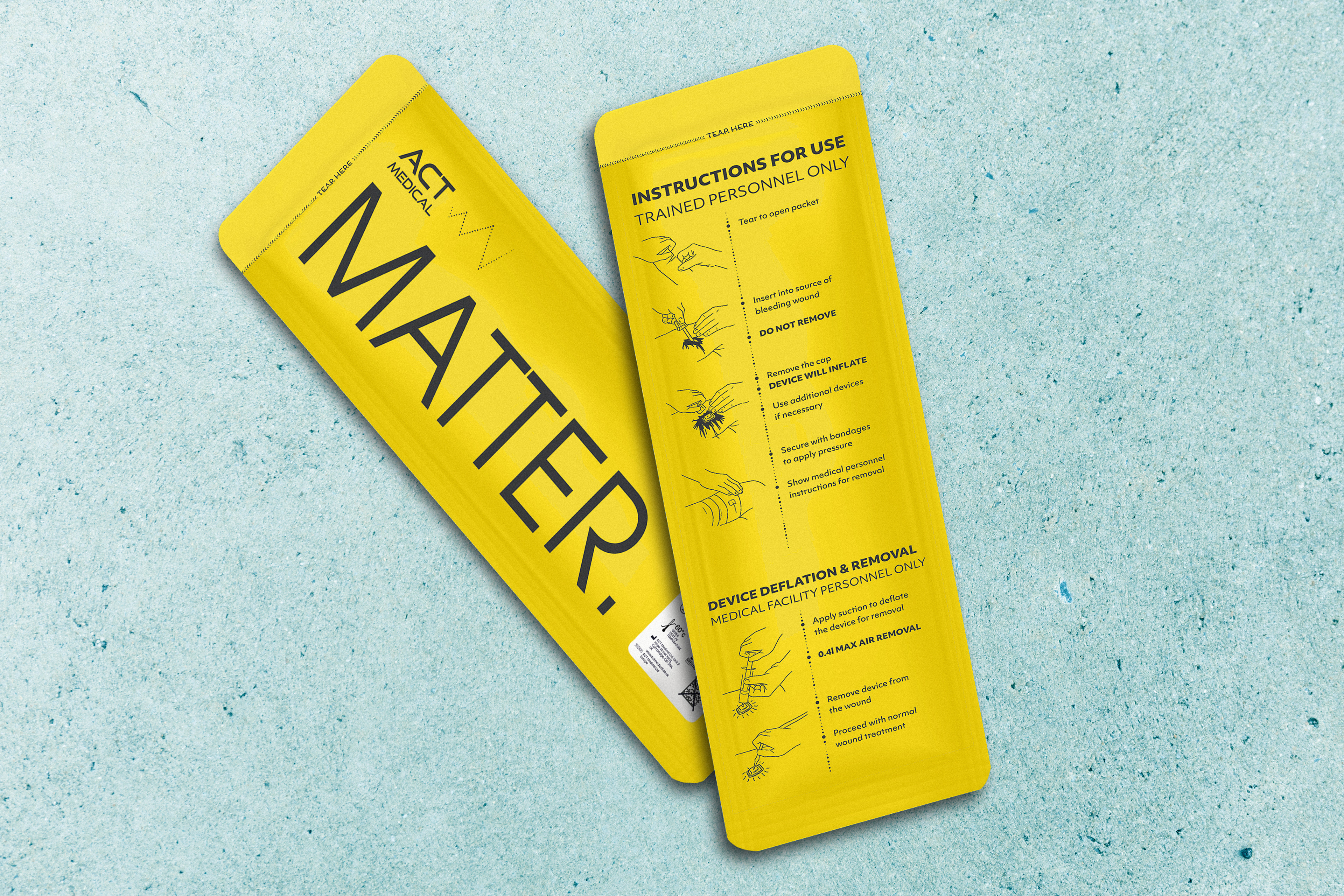
Given the nature of the product, we chose a minimalist design approach - using only essential elements to clearly communicate the intended message without unnecessary distraction.
This design approach was carried through in both the typographic and colour choices for the brand. Avant Garde was selected as the primary typeface for the logo, paired with Objectiv as the secondary typeface for supporting text. Together, these typefaces create a clean, minimal aesthetic while conveying a contemporary, soft, and trustworthy tone.
The colour palette uses strong contrasts to ensure the product is visually striking and attention-grabbing. Inspired by the "safety colours" commonly found in emergency design contexts, the chosen colours help evoke a sense of urgency, reliability, and protection.
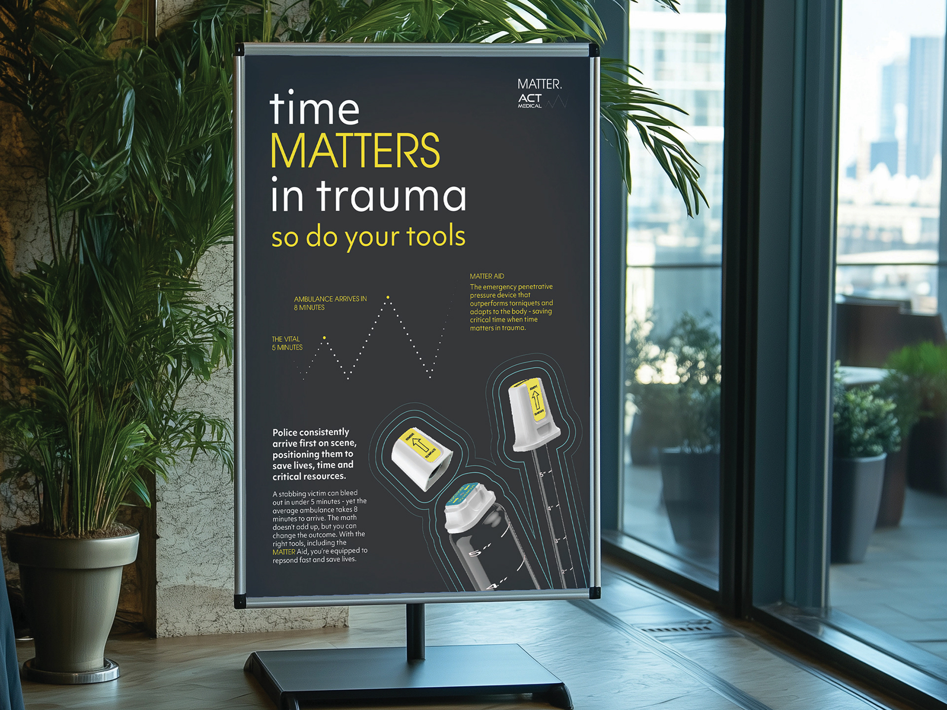
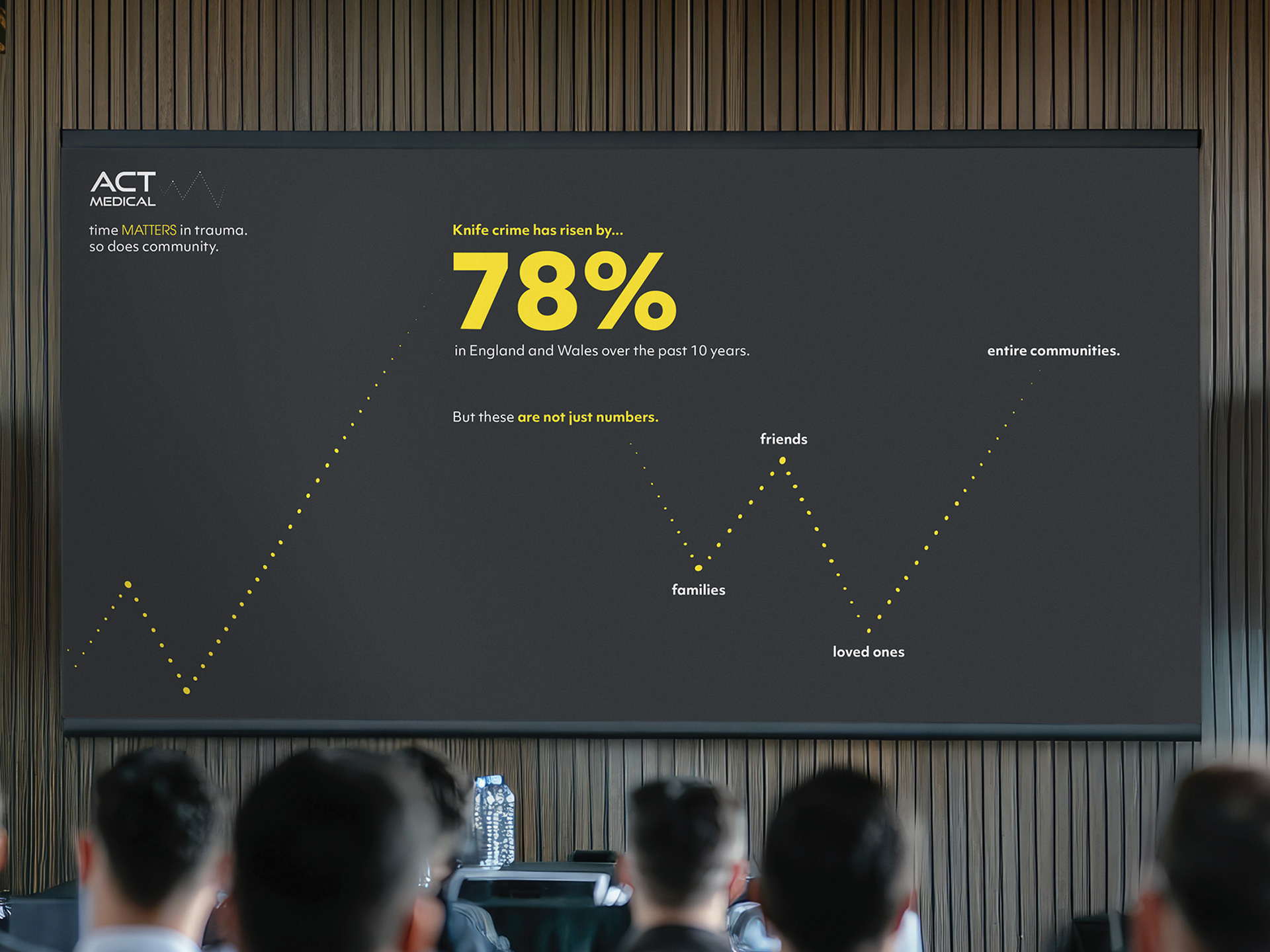
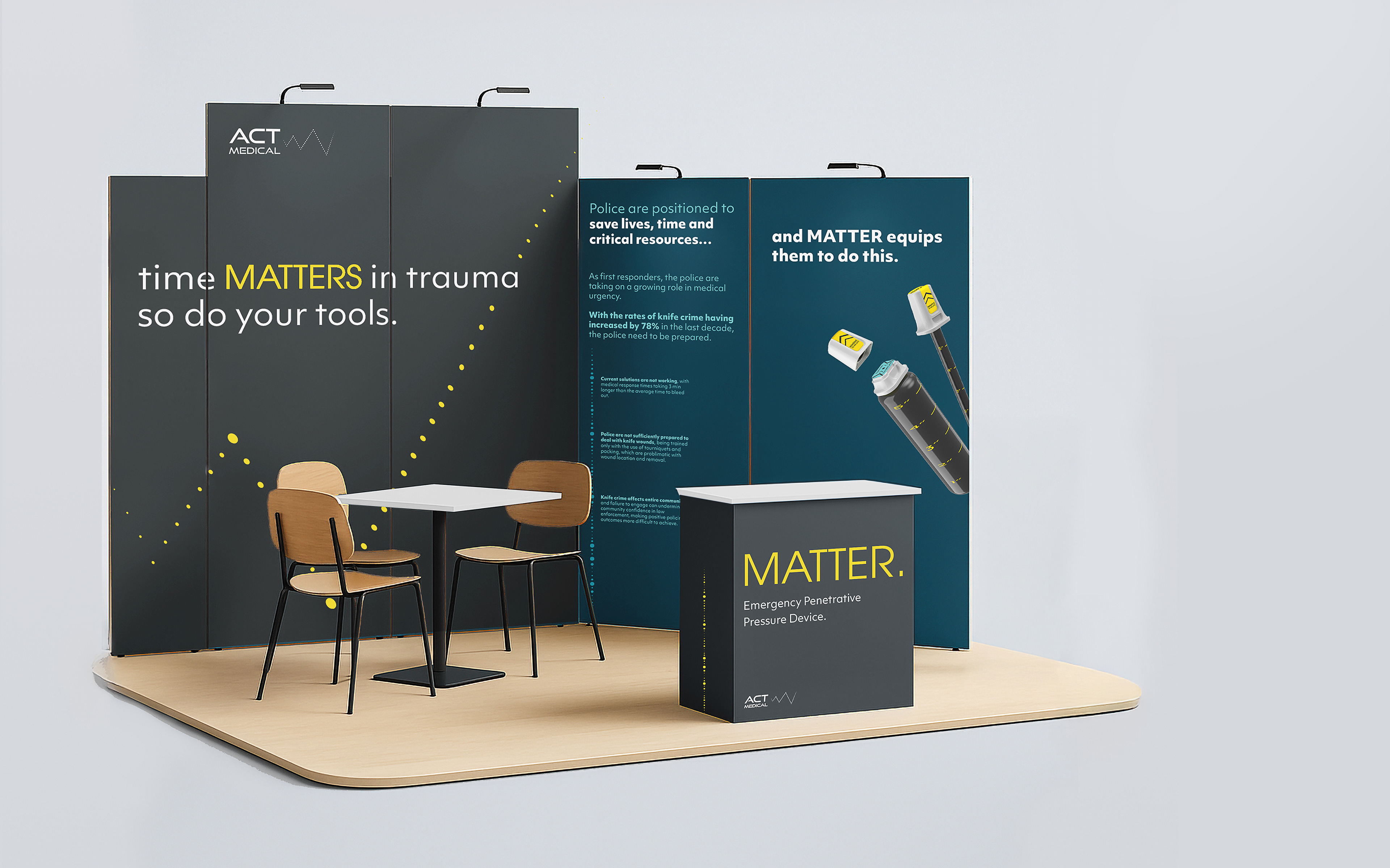
Our primary visual direction for the brand drew inspiration from the aesthetic of an ECG machine, aligning with the product’s medical function and core purpose. This was interpreted in two distinct visual forms: a zigzag motif and a linear composition made up of dots with varying weights—both referencing the visual rhythm and sound of an ECG graph from a 2D perspective.
This graphic element not only served as a distinctive and recognisable symbol for the brand but also functioned as a versatile device for presenting data in a clear and meaningful way.

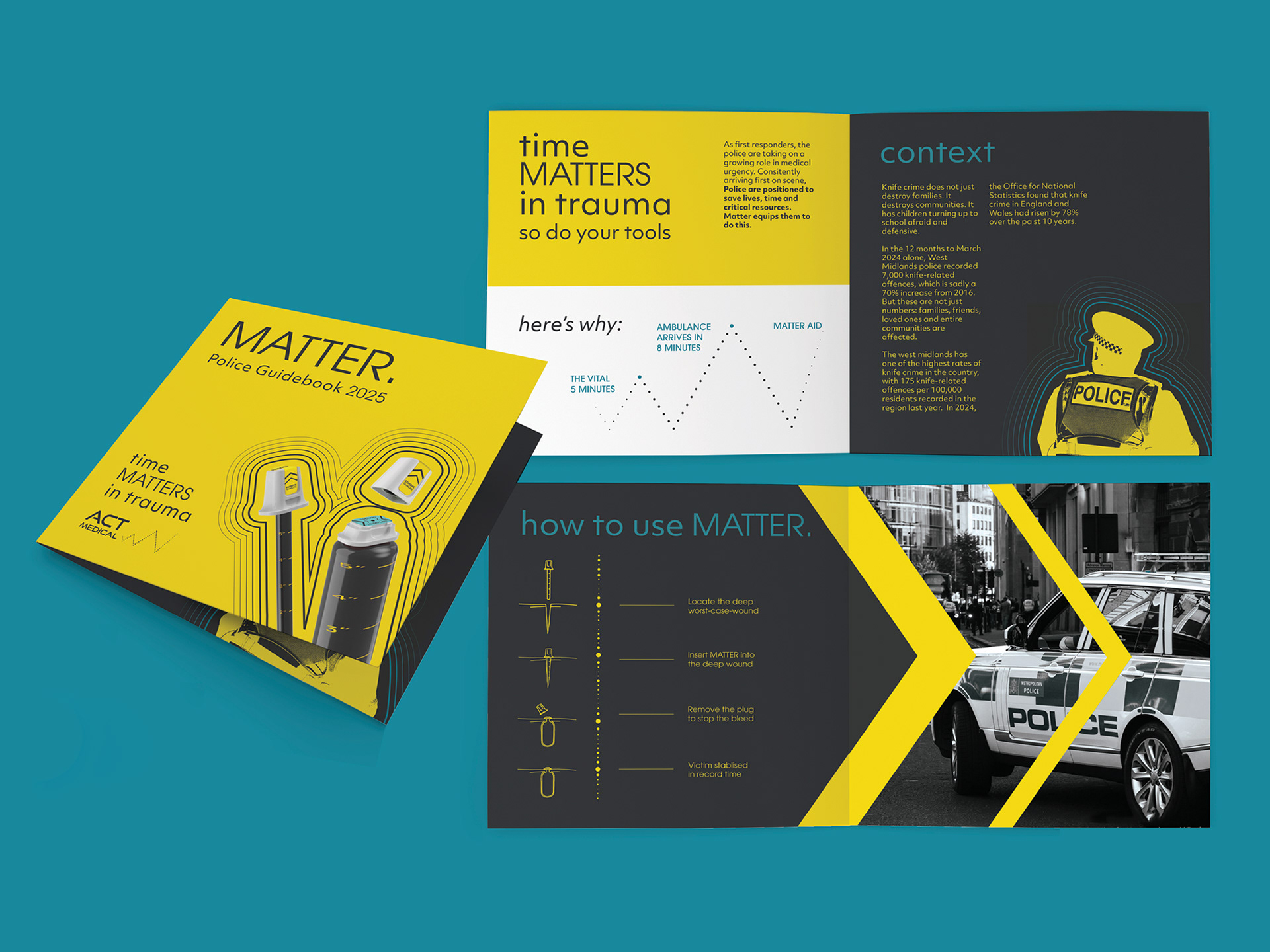

As first responders to knife crime, police are frequently in a position to save lives, time, vital resources, and protect communities. For this reason, our brand identified the police as the primary target audience, reached through posters, editorials, websites, and conferences.
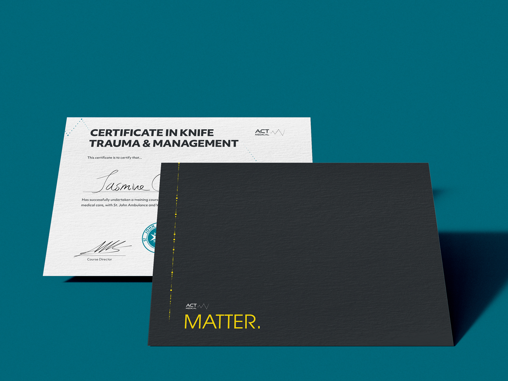
Our secondary audience focused on schools, addressing the rising rates of youth knife incidents. We created a teacher guidebook and a certificate design to promote participation in a knife trauma and management course—encouraging training while acting as a preventative measure for students feeling the need to carry knives.